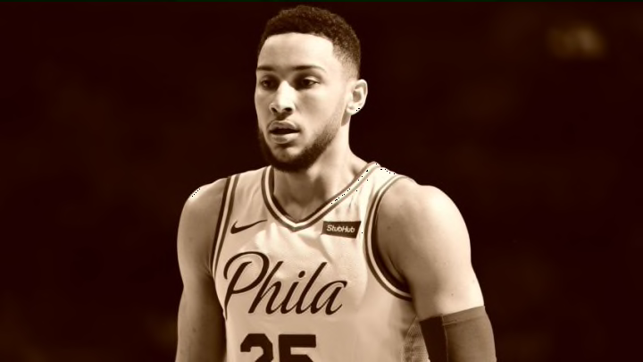
Folks, the cream rises to the top, proving true once again with the Philadelphia 76ers‘ City Edition uniform. Since Nike has taken over the rights to the NBA’s uniforms and apparel, they’ve looked to shake things up.
Part of Nike’s jersey conceptualization has been to shift away from the long-established home and away structure that has been a mainstay since the league’s inception. While under the Nike umbrella, most franchises saw the preservation of their traditional light and dark jerseys, which operated as home and away in the past. Basically Nike just renamed them the “Association” and “Icon” and freshened them up in most cases.
Where they started cooking was their introduction of what would typically be considered “alternate” uniforms, and instead dubbed them different “editions.” These editions come with titles like “Statement” or “City” that reflect the inspiration behind their designs.
Games have been visibly more vibrant this season, as teams have the freedom to rock color combos previously unseen in the NBA. I’ve enjoyed the shift away from the routine, although maybe not everyone else has.
More from Sixers News
- 3 Sixers players who could help Team USA Basketball
- 76ers 2k24 ratings: 3 most underrated players on Philadelphia roster
- 76ers head coach Nick Nurse bares lofty plans for Paul Reed this season
- Grade the Trade: 76ers swap Tobias Harris for superstar PG in mock deal
- Breaking Down Bombshell Report on Sixers Star James Harden
The Philadelphia 76ers really don’t have a bad option in their arsenal. Their looks have benefitted from simplistic, clean styling that effectively draws from their heritage without looking out of date. Also, if you don’t like the color scheme of red, white and blue then there’s probably a bigger issue at hand.
Having established that, the City Edition jerseys that the Sixers had on Friday night against the Pelicans may be unfair. After dominating through three quarters, the Sixers let their foot off the gas a bit on their way to 18-point win that somehow didn’t feel even that close.
They feature a cream colored base, accented by red and blue and a cursive font “Phila” across the chest that throws 3rd grade me into jealous rage. There is no description I can write that will do it justice, just look at it.
Look good, play good is more than a cliché. I’m legitimately worried that the 76ers look too good in those uniforms to continue wearing them. You have to harness that power and use it effectively.
So far, the 76ers are 3-1 in these uniforms, with their only loss coming when they unveiled it. They’ll be wearing them for three more games this season, and I’ll be interested to see how they fare.
The Cavaliers ruined the mystique of their black uniforms they used to beat the Warriors in Oakland to win the title two years ago by bringing them out in a panic this past year. It’s a bit of a moot point because the sleeved jerseys no longer exist, but you understand what I mean.
Next: 2018 NBA Draft Big Board 5.0
These uniforms are like a fine wine you break out on a special occasion. So while I love the look, I hope the 76ers tread lightly with this newfound power.
